第3章 图表工具
 讲义
讲义
课堂练习
题目1 饼图
数据来源:大众点评网,广州六大品牌奶茶店
样本容量:336
数据来源:大众点评网,广州6大奶茶品牌
Show the code
library(tidyverse)
library(readxl)
data <- read_excel("data/top6.xlsx")
par(family = 'STKaiti')
library(showtext)
showtext_auto()
data %>%
count(brand) %>%
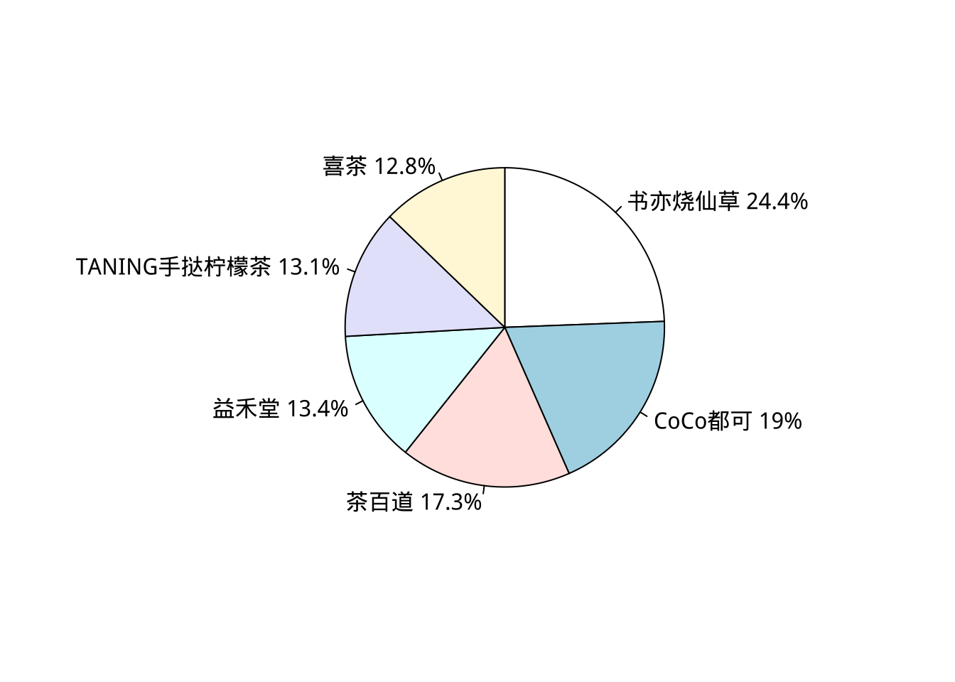
mutate(percent = round(n/sum(n)*100, 1))
# A tibble: 6 × 3
  brand                n percent
  <chr>            <int>   <dbl>
1 CoCo都可            64    19
2 TANING手挞柠檬茶    44    13.1
3 书亦烧仙草          82    24.4
4 喜茶                43    12.8
5 益禾堂              45    13.4
6 茶百道              58    17.3
Show the code
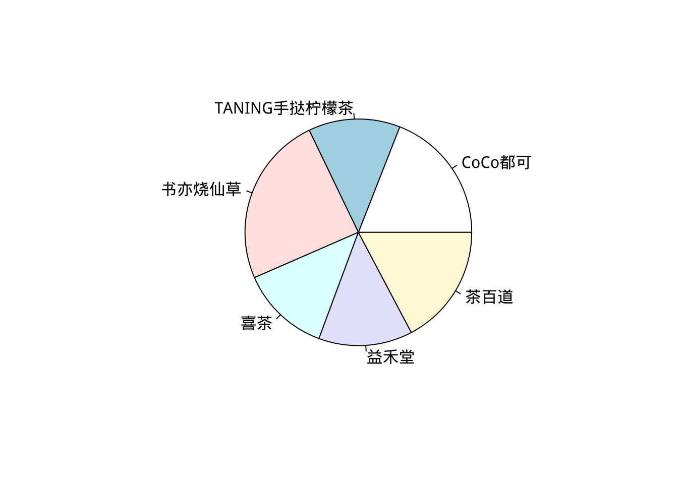
table(data$brand) %>%
  pie()
Show the code
pie_table <- data %>%
  count(brand) %>%
  mutate(percent = round(n/sum(n)*100, 1),
         per_label = paste0(brand, " ", percent, "%")) %>%
  arrange(desc(percent))

pie(pie_table$percent,
    labels = pie_table$per_label,
    clockwise = TRUE,
    init.angle = 90)
题目2 条形图
Show the code
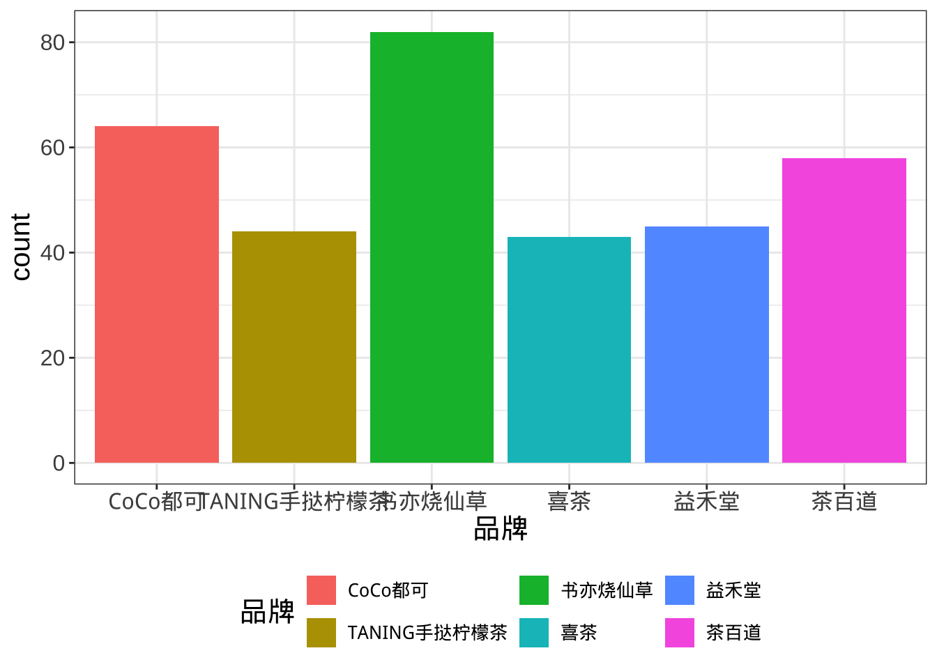
data %>% ggplot(aes(brand, fill = brand)) +
  geom_bar() +
  labs(x = "品牌", fill = "品牌") +
  theme_bw() +
  theme(text = element_text(size = 15),
        legend.position = "bottom",
        legend.text = element_text(size = 10))
Show the code
library(forcats)
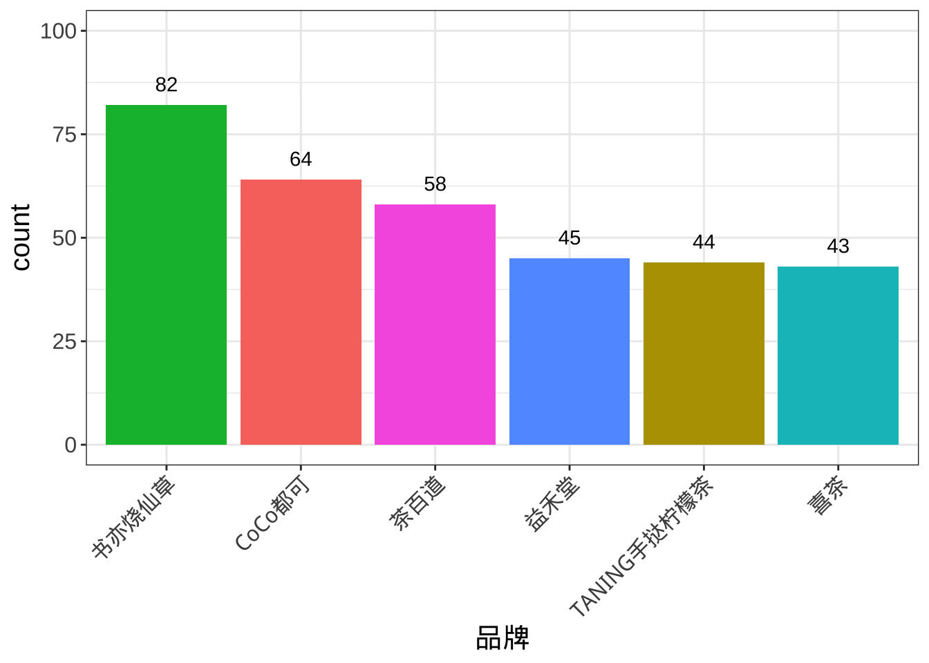
data %>% ggplot(aes(fct_infreq(brand), fill = brand)) +
geom_bar() +
geom_text(stat = "count", aes(label = after_stat(count)), vjust = -1)+
scale_y_continuous(limits = c(0,100))+
guides(x = guide_axis(angle = 45)) +
labs(x = "品牌", fill = "品牌") +
theme_bw() +
theme(text = element_text(size = 15),
legend.position = "none",
legend.text = element_text(size = 10))
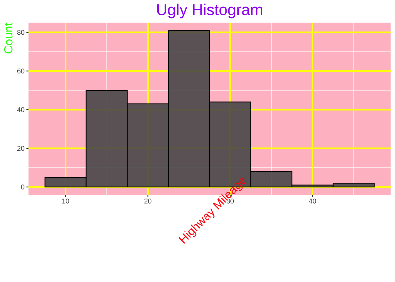
题目3 直方图
Show the code
library(ggplot2)

# 难看的直方图
ggplot(mpg, aes(x = hwy)) +
  geom_histogram(binwidth = 5, color = "black", alpha = 0.9) +
  labs(title = "Ugly Histogram", x = "Highway Mileage", y = "Count") +
  theme(
    plot.title = element_text(size = 20, hjust = 0.5, color = "purple"),
    axis.title.x = element_text(size = 15, angle = 45, vjust = 1, color = "red"),
    axis.title.y = element_text(size = 15, angle = 90, hjust = 1, color = "green"),
    legend.position = "top",
    panel.background = element_rect(fill = "pink"),
    panel.grid.major = element_line(color = "yellow", size = 1)
  )
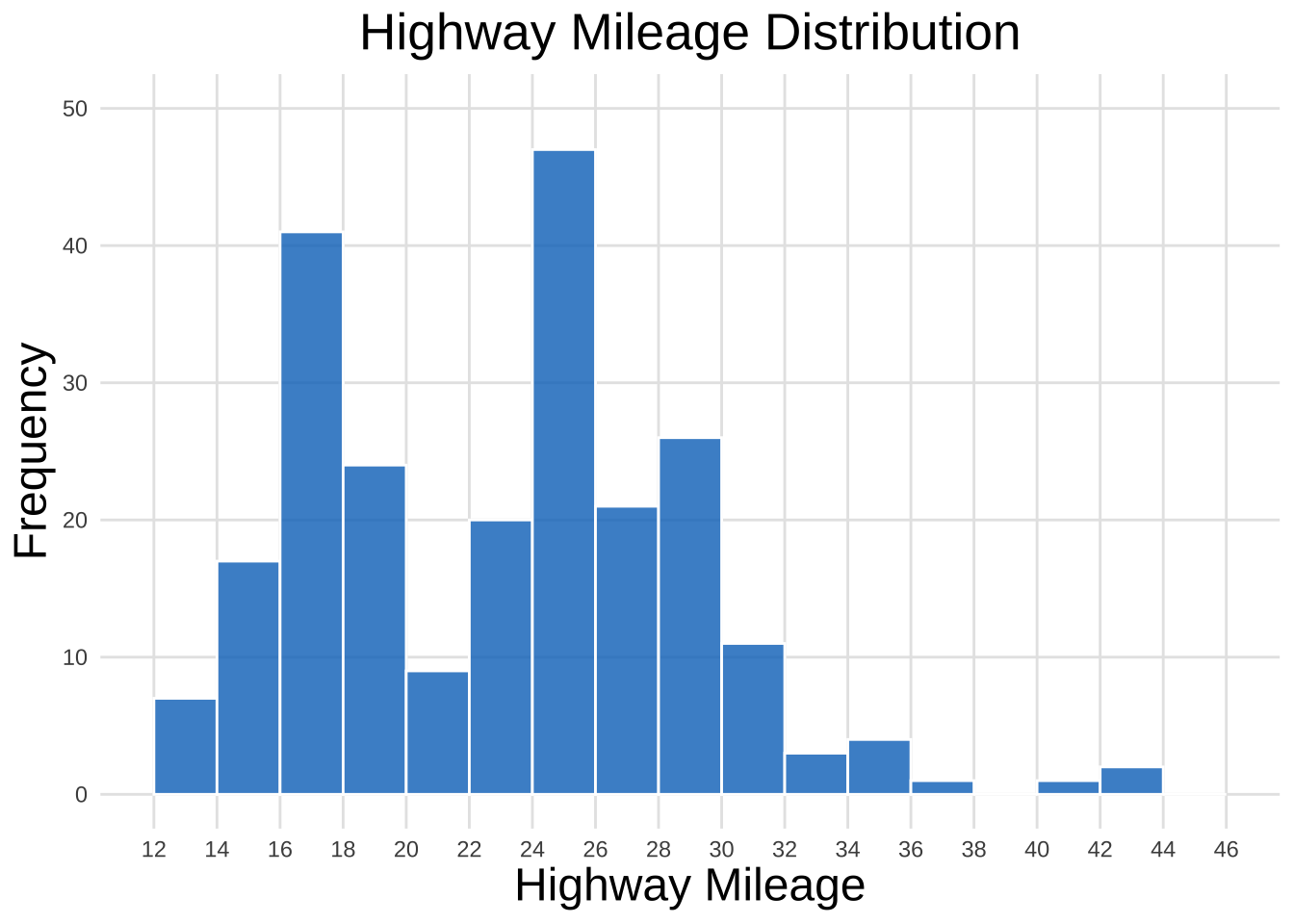
Show the code
# 好看的直方图
ggplot(mpg, aes(x = hwy)) +
  geom_histogram(breaks = seq(12, 46, 2),
                 fill = "#0073C2FF",
                 color = "white",
                 alpha = 0.8) +
  scale_x_continuous(breaks = seq(12, 46, 2),
                     labels = seq(12, 46, 2)) +
  scale_y_continuous(limits = c(0,50))+
  labs(title = "Highway Mileage Distribution", x = "Highway Mileage", y = "Frequency") +
  theme_minimal() +
  theme(
    plot.title = element_text(size = 20, hjust = 0.5),
    axis.title.x = element_text(size = 18),
    axis.title.y = element_text(size = 18),
    panel.grid.major = element_line(color = "grey90"),
    panel.grid.minor = element_blank()
  )
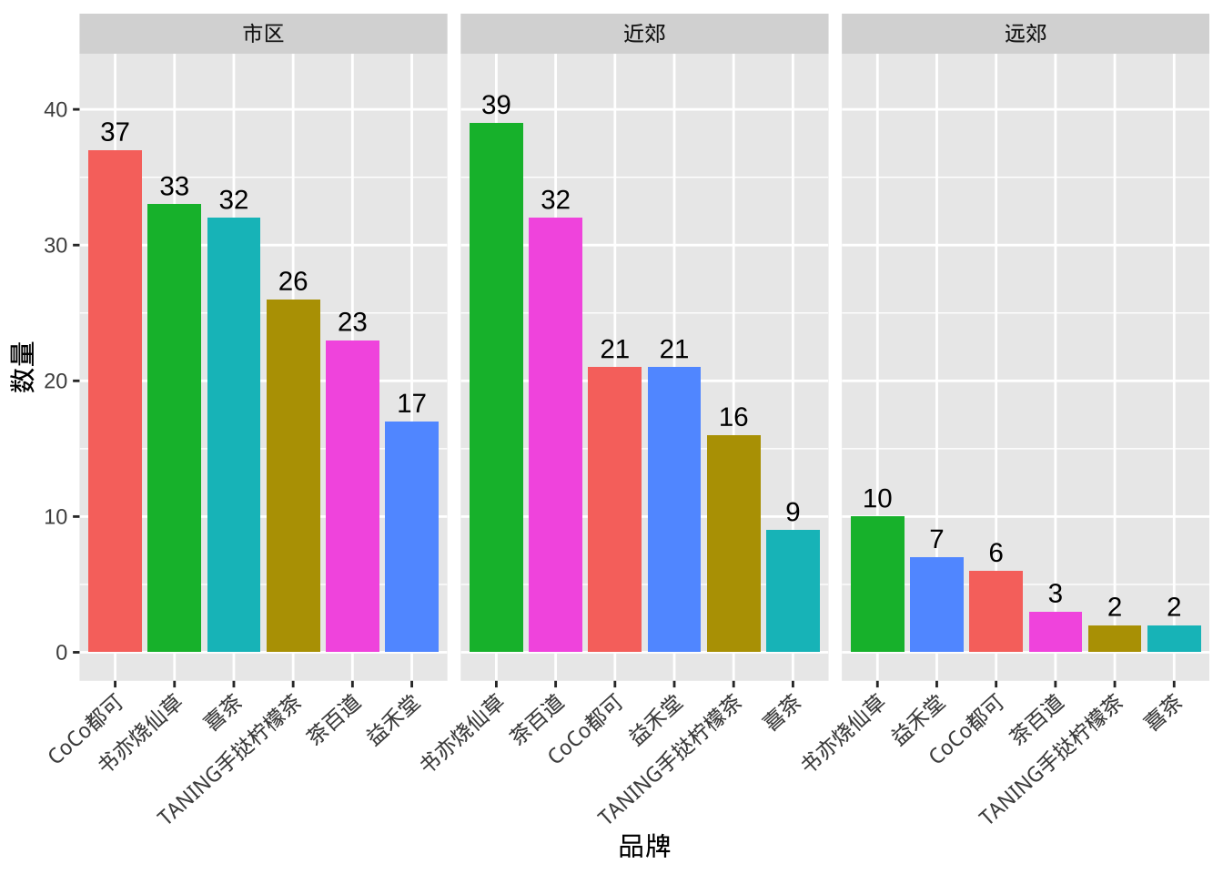
题目4 二维变量的作图
分组条形图
Show the code
data %>%
  group_by(area, brand) %>%
  summarise(count = n(), .groups = "drop") %>%
  mutate(brand_order = paste(brand, area, rank(-count), sep = "_"))  %>%
  ggplot(aes(reorder(brand_order, -count),
             count, fill = brand)) +
  geom_col()+
  facet_wrap(~ area, scales = "free_x", ncol = 3) +
  geom_text(aes(label = count), vjust = -0.5) +
  scale_x_discrete(labels = function(x) gsub("_.+$", "", x)) + # 移除排序编号
  scale_y_continuous(limits = c(0, 42)) +
  labs(x = "品牌", y = "数量") +
  theme(axis.text.x = element_text(angle = 42, hjust = 1),
        legend.position = "none")
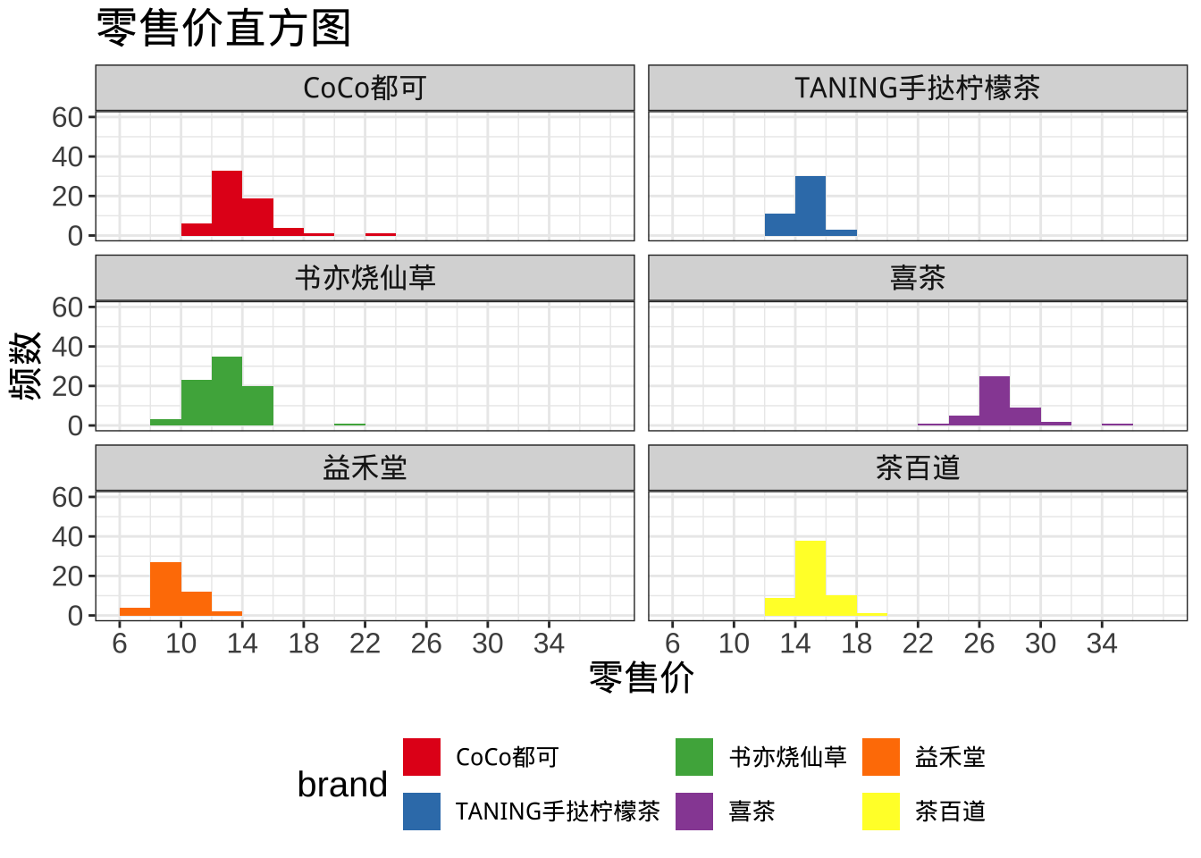
分组直方图
Show the code
#按单个定性变量分组
data %>%
  ggplot(aes(retail.price, fill = brand))+
  geom_histogram(breaks = seq(6, 38, 2))+
  facet_wrap(~brand, ncol = 2) +
  scale_y_continuous(limits = c(0,60))+
  scale_fill_brewer(palette  = "Set1") +
  labs(title = "零售价直方图",
       x = "零售价",
       y = "频数") +
  scale_x_continuous(breaks = seq(6, 36, 4),
                     labels = seq(6, 36, 4)) +
  theme_bw() +
  theme(text = element_text(size = 15),
        legend.position = "bottom",
        legend.text = element_text(size = 10))
分组直方图
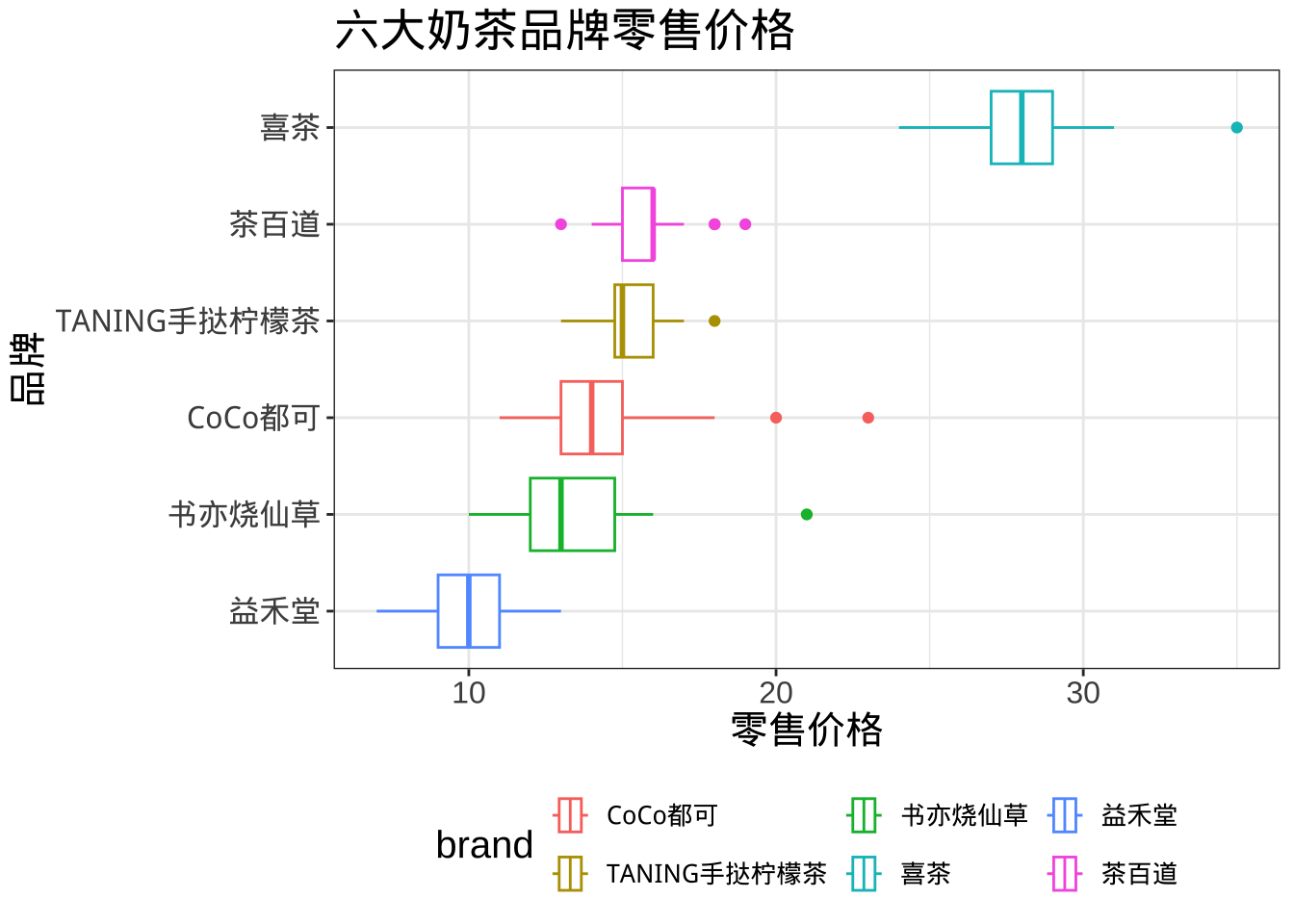
Show the code
data %>%
  ggplot(aes(retail.price, reorder(brand, retail.price, FUN = median),
             col = brand))+
  geom_boxplot()+
  labs(title ="六大奶茶品牌零售价格",
       x = "零售价格",
       y = "品牌", fill = "品牌")+
  theme_bw() +
  theme(text = element_text(size = 15),
        legend.position = "bottom",
        legend.text = element_text(size = 10))
Excel习题
习题1 毕业生.xlsx
数据文件:毕业生.xlsx(数据文件在QQ 群文件夹中),用Excel完成以下任务:
1.1 绘制毕业生性别分布的频数分布表,在表中列出男性和女性的人数及比重。
1.2 绘制毕业生性别分布的饼图和条形图。
1.3 绘制毕业生的专业人数分布的频数分布表,在表中列出各个专业的人数和百分比。
1.4 绘制毕业生各专业人数分布的帕累托图。
1.5 绘制毕业生的政治面貌的频数分布表。
1.6 绘制毕业生的政治面貌的瀑布图。
1.7 绘制毕业生的就业单位类型的频数分布表。
1.8 对毕业生先按性别、再按就业单位类型进行层级分组,绘制树状图。
1.9 对毕业生先按性别、再按政治面貌进行层级分组,绘制树状图。
1.10 绘制毕业生月薪的频数分布表,采用适宜的组矩,在表中列出各个组别的人数和百分比。
1.11 绘制毕业生月薪的直方图。
1.12 绘制毕业生月薪的频数折线图、累积百分比折线图,在图中标注出频数或累积百分比。在870位毕业生中,月薪小于等于4000、小于等于6000的各占比多少?。
1.13 绘制毕业生月薪的箱线图,在箱线图中标注出第1个四分位数、中位数和第3个四分位数。